-
Architects: Comma Studio
- Area: 78 m²
- Year: 2018
-
Photographs:Quoc Thanh, Nhat Trung
-
Manufacturers: Aconcept, An Cuong Wood, Hafele, KINGLED, Vietceramics
-
Lead Architects: Quoc Thanh

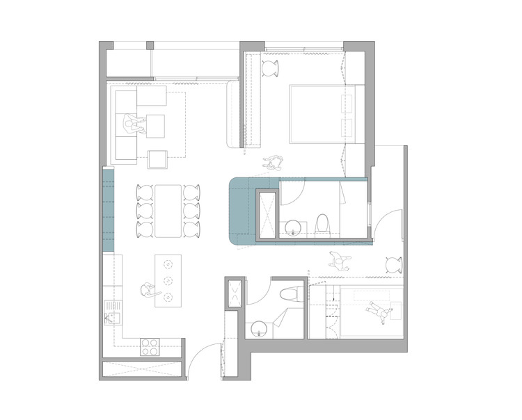
Text description provided by the architects. In this renovation project, we tried to control the integration of private and common space within the apartment in a flexible way, in the effort of giving the clients a better condition of living and sharing the space between each member of their 4 members family. The structure of the existing space contains a big volume for the kitchen, dining and living area which spreads out from the entry to the main balcony of the apartment, and the two adjacent bedrooms connect to this main space by two swing doors.


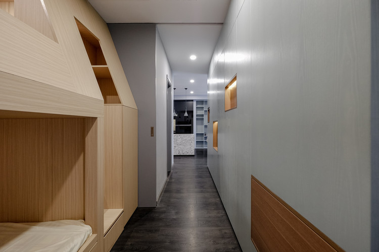
We felt that this composition leads to the isolation of the resting space in terms of spatial interaction and obstruct the unique appearance of the whole apartment. We then started the design with the thought of a change in the center of the apartment where all space around be linked together in order to re-configure the whole space. We decided to locate there an integrated wall-cabinet that serves as a focal element running through all the common – private spaces, giving to the apartment a unique appearance.

Besides, it also benefits each of the areas by offering multiple functions such as storage space, display niches and hidden-folding element… on its surface. Following this design direction, the swing doors of the two bedrooms are replaced with the full height sliding doors in order to get more flexible in controlling the open/close state of the private spaces.

When these doors are opened, they are completely hidden behind the walls and other furniture elements on both of their sides, giving the sense that the private zone are merged in to the common zone, all the interactions between these space are brought up & there is no more division between different space within the apartment.

The elements that define the center of the apartment are featured with the light gray-green paint as the color of the rosemary leaf - the favorite color of the client. It is mixed with the grey, warm wooden tone & natural light giving a calm and airy space. After renovation, beside the existing main circulation of the apartment which is as a straight way goes along with the common space as before, there is now a “sub” circulation along the featured wall that connects the entire space together.

By defining this new circulation, we located a bunk bed in the small bedroom, with a curtain for keeping its privacy when needed, and give the access to the small balcony of the apartment to everybody, which is somehow limited with the old layout of the apartment.


